



Every guide to a medical practice KPI dashboard is a list. Track these twelve numbers, or these fifteen, or these eight, and the practice will run better. The lists are not wrong, exactly. They are incomplete in a way that matters more than any single metric on them, because they never ask the question that decides whether a dashboard is worth opening at all: what will you do differently when this number moves?
That question is the whole discipline. A dashboard is a decision tool, not a scoreboard, and a number earns its place on it only if a bad reading triggers a specific action the practice controls. Website sessions, impressions, follower counts and gross production all pass the first test, since they are easy to pull and satisfying to watch climb. They fail the second. A month of higher sessions with no change in booked visits tells you nothing you can act on, and most dashboards are full of exactly that kind of number.
The metrics that belong are the ones tied to a lever. If the no-show rate climbs, the reminder sequence gets rebuilt. If the gap between inquiries and booked visits widens, the phone gets fixed before another dollar goes to advertising. If patient acquisition cost rises while the value of a new patient stays flat, the channel mix changes. Each of those readings names its own response, which is the point. Build the dashboard backward from the decisions you make every week rather than forward from whatever the software already reports, and the vanity metrics fall away on their own.
Laid out that way, the dashboard is short. Here is what belongs on it, what each number is telling you, which lever to pull when it moves the wrong way, and the flattering metric it replaces.
What belongs on the dashboard, and what to do when it moves
| Metric | What it tells you | The lever when it moves the wrong way | The vanity metric it replaces |
|---|---|---|---|
| New patients (booked and completed) | Whether growth is actually happening | Acquisition channel mix and speed-to-lead | Website sessions and impressions |
| Patient acquisition cost, by channel | What each new patient truly costs | Cut or scale specific channels | Cost per click and cost per lead |
| Inquiry-to-booked-visit rate | Whether the front desk converts demand | Phone answer rate and follow-up speed | Total lead volume |
| No-show rate | Where scheduled revenue leaks | Reminder cadence and cancellation policy | Appointments booked |
| Retention / return-visit rate | Whether patients come back | Recall and reactivation systems | Total visit count |

The first row is the one most practices get wrong, and it is wrong in a way that hides the other four. New patients counted at booking is not the same as new patients counted at completion, and the distance between the two is where a surprising amount of marketing money disappears. A patient who books online and never arrives cost the same to acquire as one who arrived, was treated and scheduled a follow-up, but only one of them is growth. A dashboard that counts bookings will report a good month while the schedule quietly empties. That distance is also one of the easiest things to measure once someone decides to, since both numbers already live in the scheduling system. If the practice offers virtual visits, count booked and completed video appointments as their own line for the same reason, since that is how you learn whether your telehealth marketing is producing visits rather than clicks.
This is why the count belongs at the end of the healthcare marketing funnel rather than the middle. Every stage before a completed visit is a proxy, and proxies drift. Impressions rise when a competitor stops advertising. Clicks rise when an ad gets more emotional. Form fills rise when the form gets shorter. None of that is bad, but none of it is a decision either, and a dashboard that reports proxies invites the practice to optimize the proxy. Counting completed visits by source is harder to set up and impossible to fool.
Acquisition cost by channel is the second row, and the phrase by channel is doing the work. A single blended cost tells you whether marketing is expensive; a cost per channel tells you what to do about it. When the number rises, the lever is not to spend less everywhere. It is to find the channel whose cost per completed visit has drifted above what a new patient is worth to the practice, and cut or restructure that one while the channels still producing patients at a sensible cost keep their budget. Cost per click and cost per lead, the numbers most ad platforms lead with, cannot support that decision, because a cheap click that never becomes a patient is not cheap.
The third row is where the front desk enters the dashboard, and it is usually the row that produces the most uncomfortable reading. Inquiry-to-booked-visit rate is the share of people who contacted the practice and ended up on the schedule. When it falls, the instinct is to blame lead quality, and sometimes that is right. More often the phone rang and nobody answered, or a voicemail was returned two days later, or the person who answered could not offer an appointment inside a reasonable window. Every one of those is a fixable operational problem, and every one of them is invisible to a dashboard that reports total lead volume, which will keep climbing while the schedule does not.

No-show rate is the fourth row, and it is the cleanest example of a metric that names its own response. When it rises, two levers exist, and the dashboard should make clear which one to pull first. The tactical lever is the reminder cadence: how many touches, through which channels, at what intervals before the visit. The structural lever is the appointment cancellation policy, meaning the terms patients agree to when they book and what the practice does when those terms are broken. A practice that pulls only the tactical lever sends more reminders to the same patients who ignored the last ones. A practice with a clear, consistently applied policy changes the behavior the reminders are chasing.
The fifth row, retention or return-visit rate, is the one dashboards most often leave off entirely, because it is slow and unglamorous and nothing about it lights up green. It is also the metric with the most leverage over the other four. A practice that keeps its patients needs fewer new ones, spends less to acquire each of them, and books a larger share of its schedule from people who already trust it. When the return-visit rate slips, the lever is a working recall and patient reactivation system: a defined interval after which a patient who has not rebooked gets a personal outreach rather than a generic newsletter. Total visit count, the vanity metric this row replaces, will hide a retention problem for a long time, because new patients from marketing backfill the ones leaving out the side door. Screening-driven specialties feel this most: in gastroenterology marketing, the recall list of patients due for a repeat procedure is often the largest untapped source of volume the practice already has.
There is one more input worth a place on the screen, though it does not fit neatly into the five rows. Review score and review recency behave like a leading indicator for the retention row and the acquisition row at once. A slide in average rating, or a stretch of weeks without a new review, usually shows up before the return-visit rate moves and well before acquisition cost climbs, because prospective patients read reviews before they call and existing patients write them after something went wrong. The lever is the practice’s online reputation management for doctors process: the cadence of review requests, their timing, and how the practice responds when a bad one lands. Rating alone is not the metric. Rating together with volume and recency is.
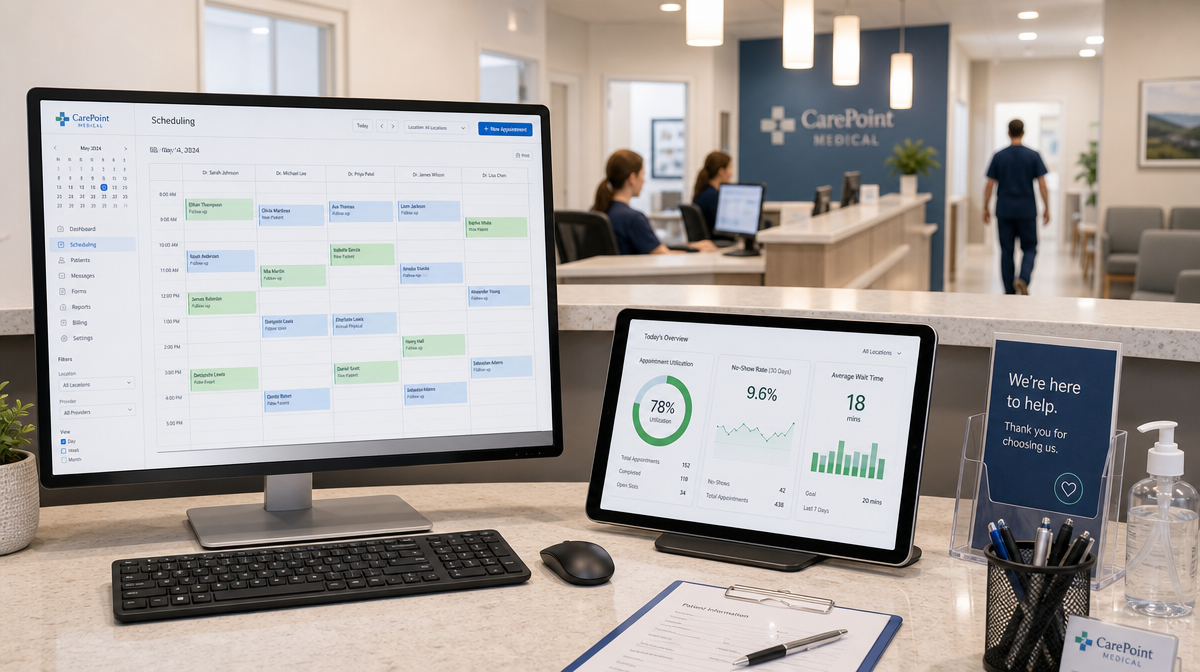
Everything above assumes the practice can actually see these numbers, and that assumption is where healthcare differs from every other business a dashboard vendor has built for. In most industries the highest-intent customer action is a click, and clicks are the one thing analytics measures perfectly. In a medical practice the highest-intent action is a phone call, made by someone who searched, found the practice, and decided to talk to a person rather than fill out a form. Standard website analytics records that person as a visitor who left without converting. The most valuable behavior in the entire funnel registers as a bounce. Add the patients who saw the practice on a phone screen, remembered the name, and typed it into a maps app a day later, and the picture gets worse: the channel that produced them gets no credit, and whichever channel happened to be open when they finally clicked gets all of it.
Closing that gap is possible, but not free, and not without obligations. Call tracking, form attribution and intake questions that ask how a patient found the practice will connect a completed visit back to its source. They also collect information about a person who is now, or is about to become, a patient, which brings the practice’s privacy responsibilities into what would otherwise be a marketing configuration. The exact rules for tracking technologies on healthcare websites have been contested and continue to shift, so the responsible position is to treat every tracking decision as a HIPAA-conscious one rather than a purely technical one: know what each tool collects, where it sends that data, and whether the practice would be comfortable explaining the arrangement to a patient. The practical consequence for the dashboard is that it should be built to count what happened, meaning completed visits, calls answered and referrals received, rather than what analytics can see. The first set of numbers is the practice’s own and can be measured on its own terms.
Two categories of metric belong on the dashboard for a different reason than the five rows, and they are worth naming so they are not mistaken for vanity. The first is quality reporting. Practices that participate in Medicare’s Merit-based Incentive Payment System report against measures that CMS defines and publishes in advance, and the program’s quality performance requirements specify how those measures are collected and scored. That matters here for a reason that has nothing to do with reimbursement: those measures are defined the same way for everyone by someone other than the practice, which is exactly the discipline most internally built dashboards lack. A number whose definition quietly changes between quarters cannot trigger a decision, because nobody can tell whether the number moved or the definition did.
The second is the revenue cycle. Days in accounts receivable, denial rate and net collection rate are not marketing metrics, but the AMA’s guidance on revenue cycle management for private practices makes the same argument this article makes about everything else: the practice should be monitoring its receivables reports on a schedule rather than discovering a problem when the money fails to arrive. A denial rate that rises names its own lever, usually a specific coding or verification step, in the same way a no-show rate does. The test for including any of these is the same as for the five rows. If the practice knows what it will change when the number moves, the number belongs.

A newer input is starting to deserve a row of its own. A growing share of prospective patients ask an AI assistant which practice to see before they search at all, and the assistant answers from what it can find and verify about the practice. That makes AI-driven search visibility a measurable thing: whether the practice is named, described accurately, and cited when someone asks a question it should be the answer to. It is early, and the tools for measuring it are immature, but a practice that watches it now will notice the shift in where new patients come from before a competitor does.
This is also where attribution stops being a reporting problem and becomes the foundation the whole dashboard rests on, which is the part of the system A.L.I. 360 by Target Patients MD is built around. A.L.I. 360 by Target Patients MD is a proprietary AI-powered patient-acquisition system for medical and dental practices. The name stands for Attract, Learn, and Influence. The Learn stage is the relevant one here: it attributes each booked patient to the source that actually produced them, including the ones who called, so the acquisition-cost row runs on completed visits rather than on last-click guesses from a platform that never saw the phone ring.
With the rows chosen and the sources connected, the remaining question is cadence, and the answer follows from the same logic as everything else. The rows that move fast and name a fast response, meaning new patients booked and completed, the inquiry-to-visit rate and the no-show rate, want a short weekly look by whoever owns the front desk and the schedule. The rows that move slowly, meaning acquisition cost by channel and the return-visit rate, want a monthly review with enough of the team present that the decision the number is pointing to can actually be made in the room. A dashboard reviewed on no particular schedule becomes wallpaper within a couple of months, and a dashboard reviewed daily produces reactions to noise.
The practices that get real value from a medical practice KPI dashboard are rarely the ones with the most sophisticated software. They are the ones that decided, before building anything, which five or six decisions the dashboard exists to support, and then refused to add a number that did not serve one of them. That restraint is harder than it sounds, because every system the practice uses will offer more metrics than it needs, and every one of them will look like insight. The dashboard’s job is to make the practice’s next decision obvious. Anything on the screen that does not do that is decoration.
A few questions come up repeatedly when practices set this up.
- What is a medical practice KPI dashboard?
A single view of the small set of numbers a practice uses to make decisions, pulled from scheduling, billing and marketing sources. The useful ones are built backward from the decisions they support, not forward from whatever the software can report. - What KPIs should a medical practice actually track?
New patients booked and completed, patient acquisition cost by channel, inquiry-to-booked-visit rate, no-show rate and return-visit rate. Each one names a specific response when it moves the wrong way, which is the test for inclusion. - What’s the difference between a useful metric and a vanity metric?
A useful metric triggers a specific action when it moves. A vanity metric moves without telling you what to do. Website sessions, impressions and follower counts are the common examples of the second kind. - Why can’t a practice just use standard website analytics?
Because the highest-intent action in healthcare is a phone call, which analytics records as a visitor who left. Closing that gap requires call tracking and intake attribution, and those collect patient information, which raises privacy obligations a generic analytics setup ignores. - How often should a practice review its dashboard?
Fast-moving rows such as new patients, inquiry conversion and no-shows want a brief weekly look. Slower rows such as acquisition cost by channel and return-visit rate want a monthly review with the team present so the decision can be made in the room.